Form, Materiality, & Structural Design
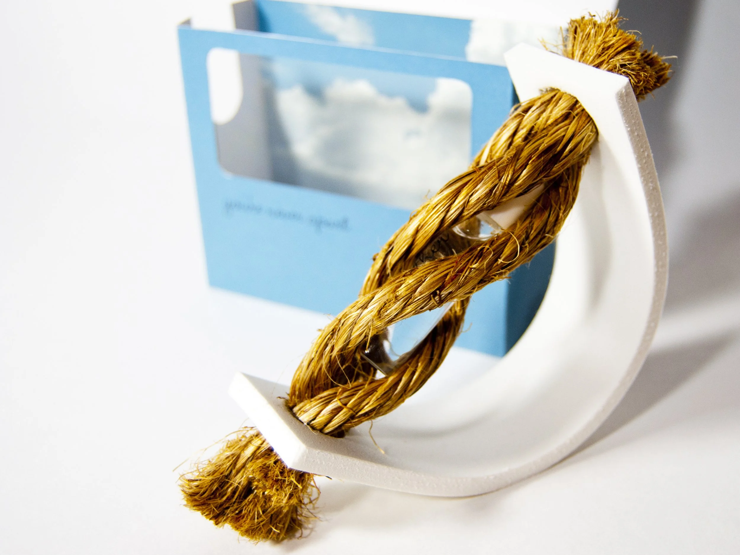
Transitioning from abstract concept to physical tactile experience requires a meticulous balance of form and function. In this stage, I focus on the structural design of the primary and secondary packaging, selecting a multi media approach. Cut rope, high-quality paper stocks, rubber, glass, and plastics. I design the layout of the exterior carton with strict attention to spatial hierarchy, considering how the box unfolds to create a premium unboxing experience. Every material choice, from magnetic closures, encased rope container to an embossed type transfer, is selected to communicate a tactile experience and elevate the product's perceived value as well a explain a story.
Typography, Graphics, & Visual Assets
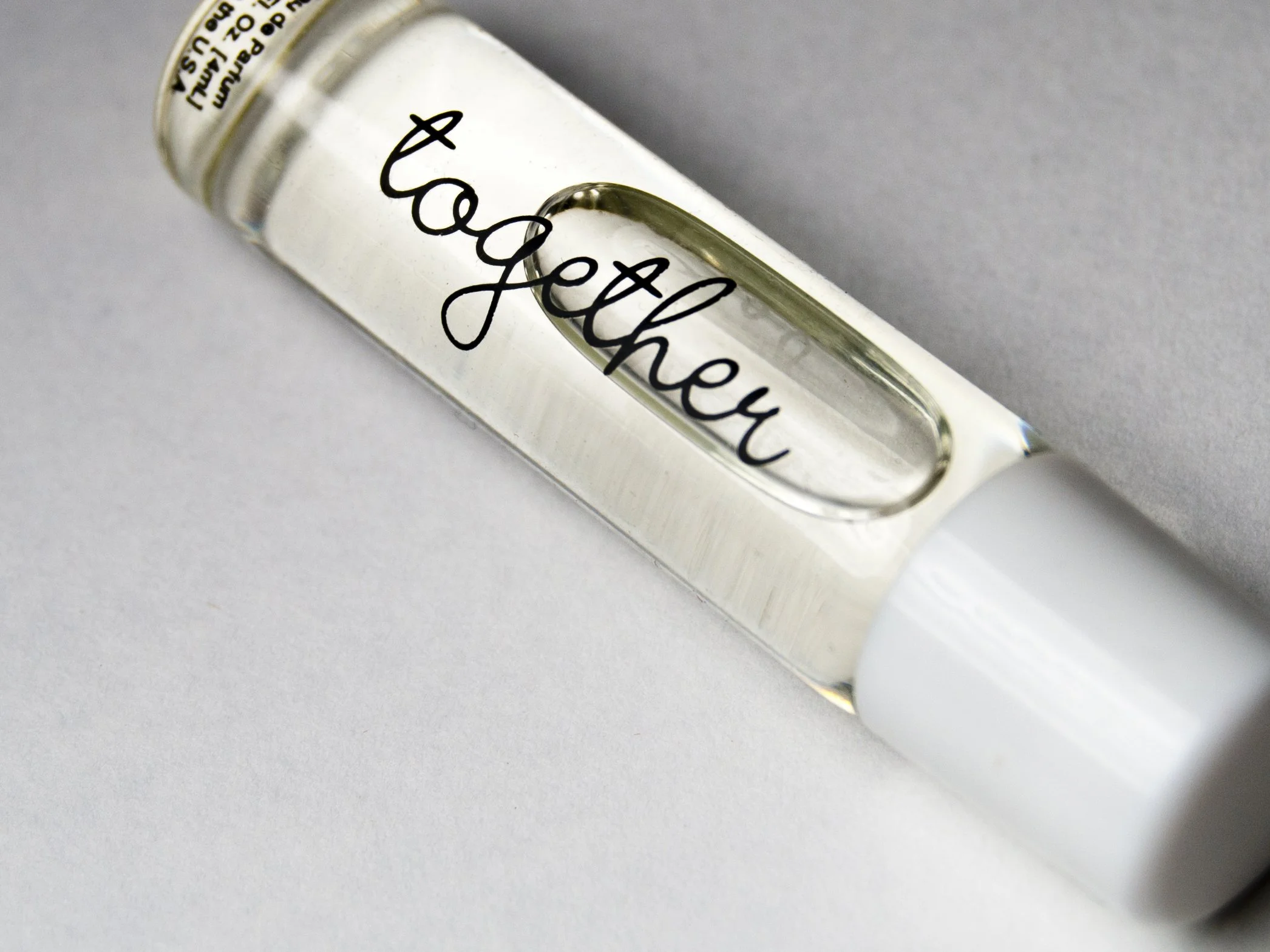
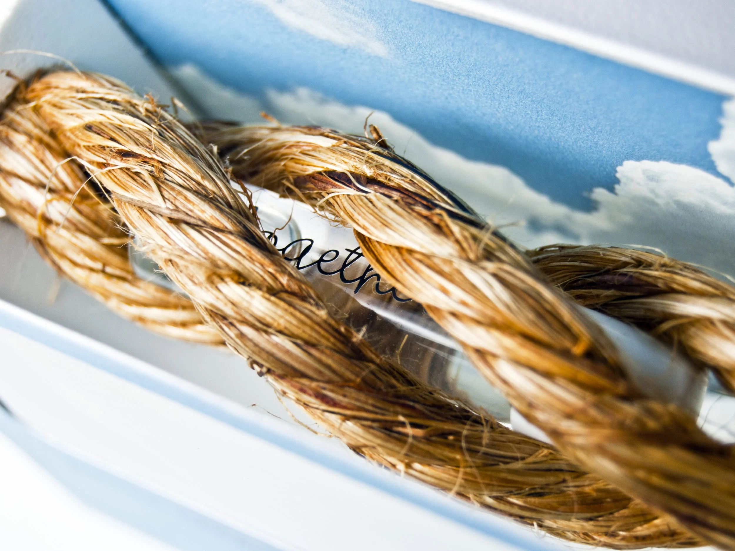
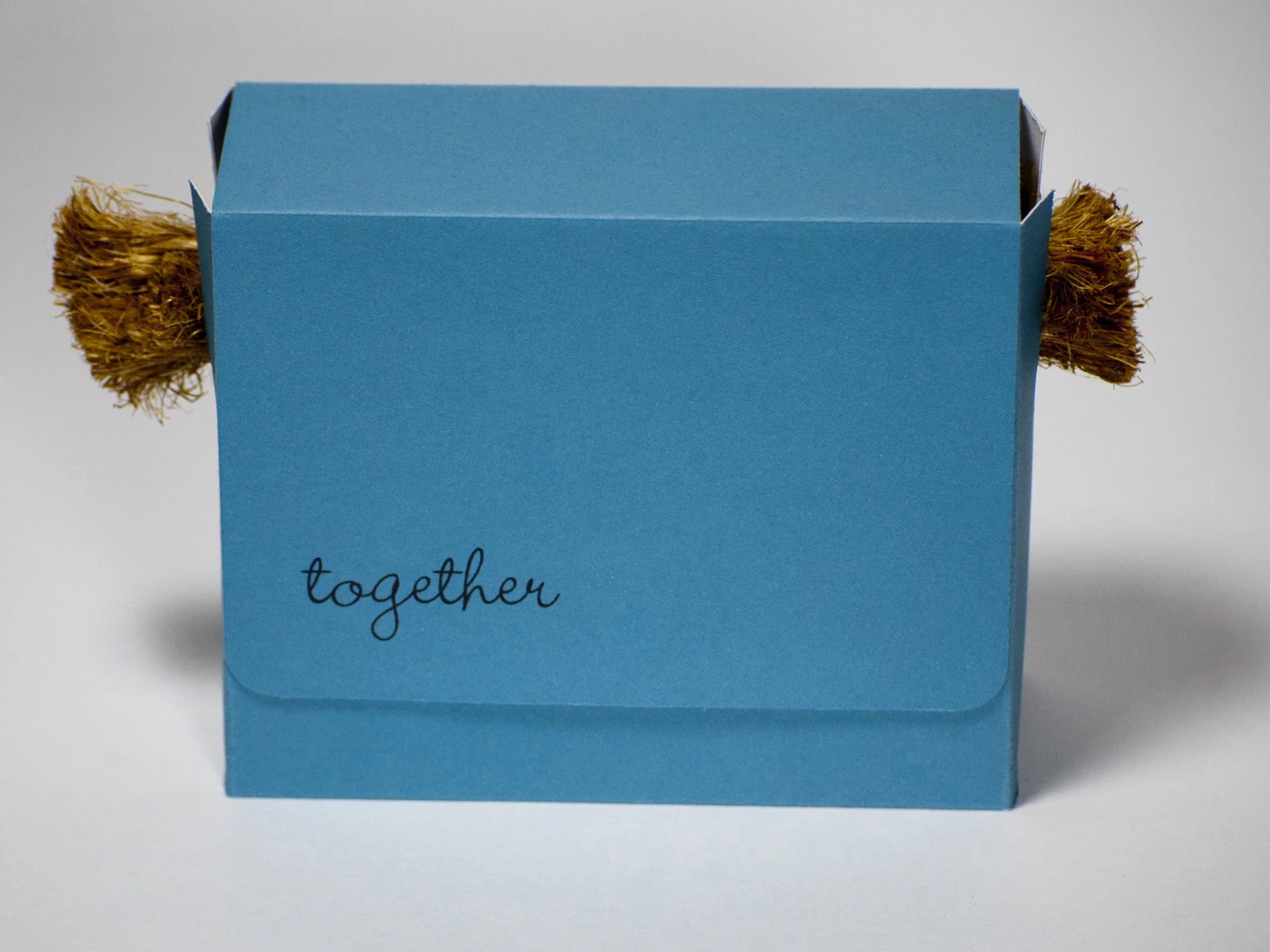
With the structural canvas defined, I craft the graphic identity that will live on the bottle and box. This involves selecting a “hand written” cursive font and the word choice “together” that brings attention to the humanistic nature of love. The blue color and sky image was chosen to represent space and distance on the packaging. This illustrated being away from your lover / significant partner. From the outside of the box you see blue and cut rope to represent a cut off of connection. When the flap is opened you are struck with the perfume bottle “together” and see it encased in an intertwined rope “perfume holder.” Representing a reuniting of love.
Production & Execution
The final phase bridges creative vision and manufacturing. This came in three parts. The primary: outer packaging, the secondary: perfume display holder and finally the perfume bottle.
After carefully creating the custom die line cuts for the packaging. I made sure the schematics contained holders on the sides to have the rope sit. A cut out viewing window upon opening and space for the magnetic flaps enclosures. Linen paper was selected for a higher quality feel and a more tactile experience. Once printed, folded and formed the next step was the bottle. To apply the lettering and copy text onto the perfume bottle I used an Ultra Violet Direct-to-Film print transfer.
“Perfume Packaging”
Concept & Brand Strategy: Setting the Narrative
Every fragrance has a story, and the packaging is its first sensory touchpoint. The design process begins by deeply aligning with the brand identity and how that translates to the visual design. I dive into mood boarding, visual positioning, and conceptual development to define the visual narrative of the scent. Whether the fragrance evokes minimalist, modern luxury or romantic, vintage nostalgia, this phase establishes the typographic style, core color palette, and architectural silhouette of the bottle. By grounding the project in a firm strategy, I ensure the final aesthetic resonates emotionally with the target demographic.