Design Execution & Production
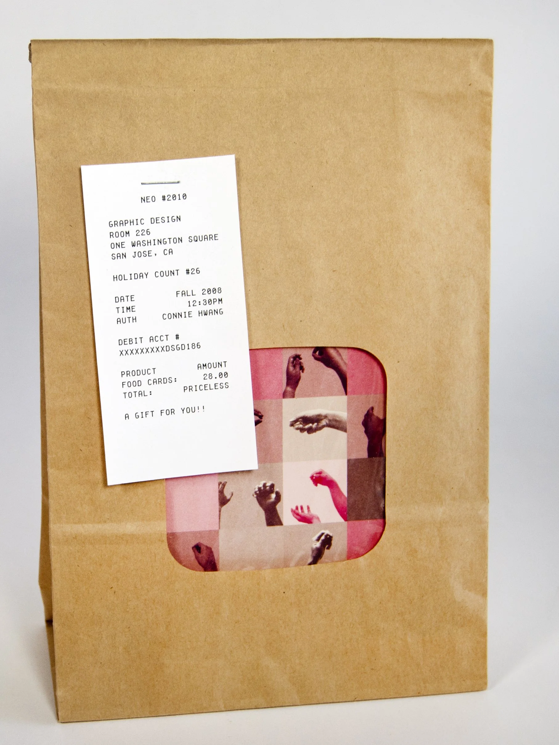
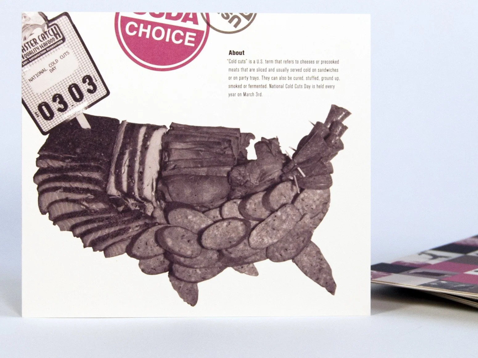
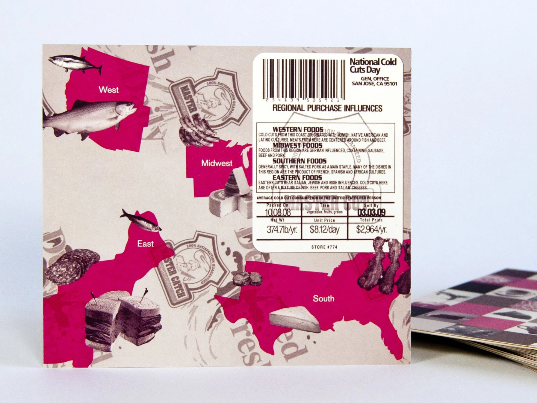
For my component of the series, I chose to highlight National Cold Cut Day, transforming a quirky culinary celebration into a sophisticated, editorial design piece. My visual execution relied on a bold typographic hierarchy and stylized, reductive graphics of layered meats, utilizing a curated color palette that balanced mid-century butcher-shop nostalgia with a clean, contemporary aesthetic. To transition the project from screen to tangible media, we partnered closely with a commercial printer to navigate pre-press production, managing technical specifications like paper stock weights, exact ink coverage, and precise crop marks. Beyond the card itself, I also engineered custom structural packaging designed to house the entire classroom collection, ensuring the tactile unboxing experience reflected the rigorous print production and premium presentation of the promotional series.
Key Takeaways
Client & Studio Constraints: Navigating shared production parameters taught me how to balance individual artistic freedom with strict, collaborative guidelines to ensure visual consistency across a multi-designer campaign.
Pre-Press & Manufacturing: Partnering directly with a commercial printer provided invaluable experience in translating digital files into tactile assets, emphasizing the importance of file setup, bleeds, and stock selection.
Structural Package Design: Designing the housing container highlighted the intersection of 2D graphic layouts and 3D structural engineering, ensuring the final packaging was both functional and visually aligned with the premium look of the cards.
“Food Holiday Card”
Project Overview
In our collaborative design school studio, our cohort embarked on a joint project where each student selected a single unique food holiday from the annual calendar to promote through a custom-designed flyer card. Working alongside fellow student designers allowed us to simulate a professional creative studio, where we established shared production baselines to ensure our individual pieces felt cohesive as a collective series. While we each maintained complete creative autonomy over our chosen holiday, the collaborative process required frequent peer critiques and design alignment to balance our diverse aesthetic voices, coordinate our grid systems, and unify the overall visual pacing of the final set.