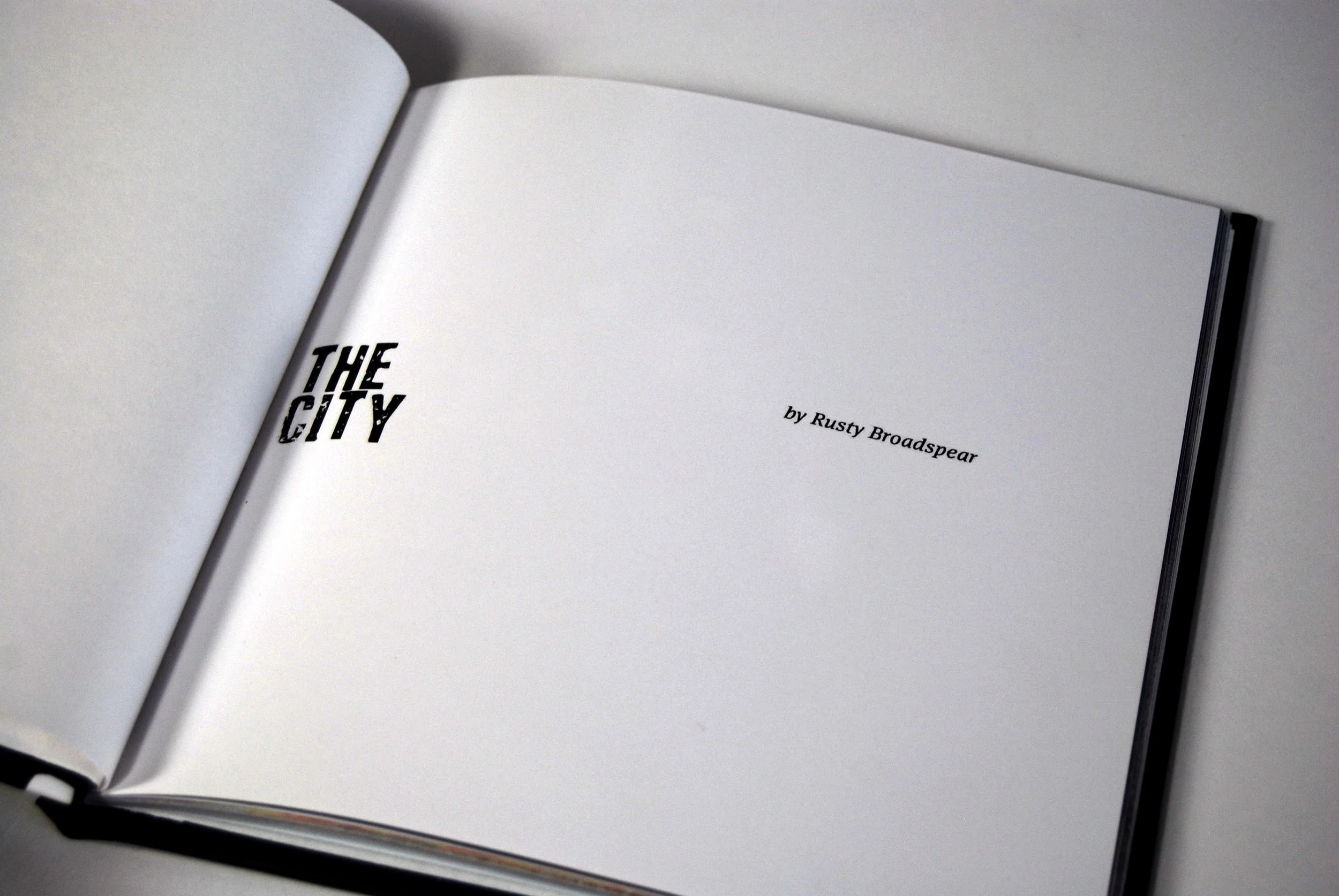
The typography was chosen to express the story line and give “color to the readers experience. A book's typeface should never compete with the prose; instead, it must serve as a seamless bridge between the text and the reader’s eye. Every detail such as the micro-typography—meticulously adjusting the tracking, kerning, leading, and column widths to eliminate visual friction and prevent reader fatigue was thought out. A hierarchy of text gives rhythm to the literature.
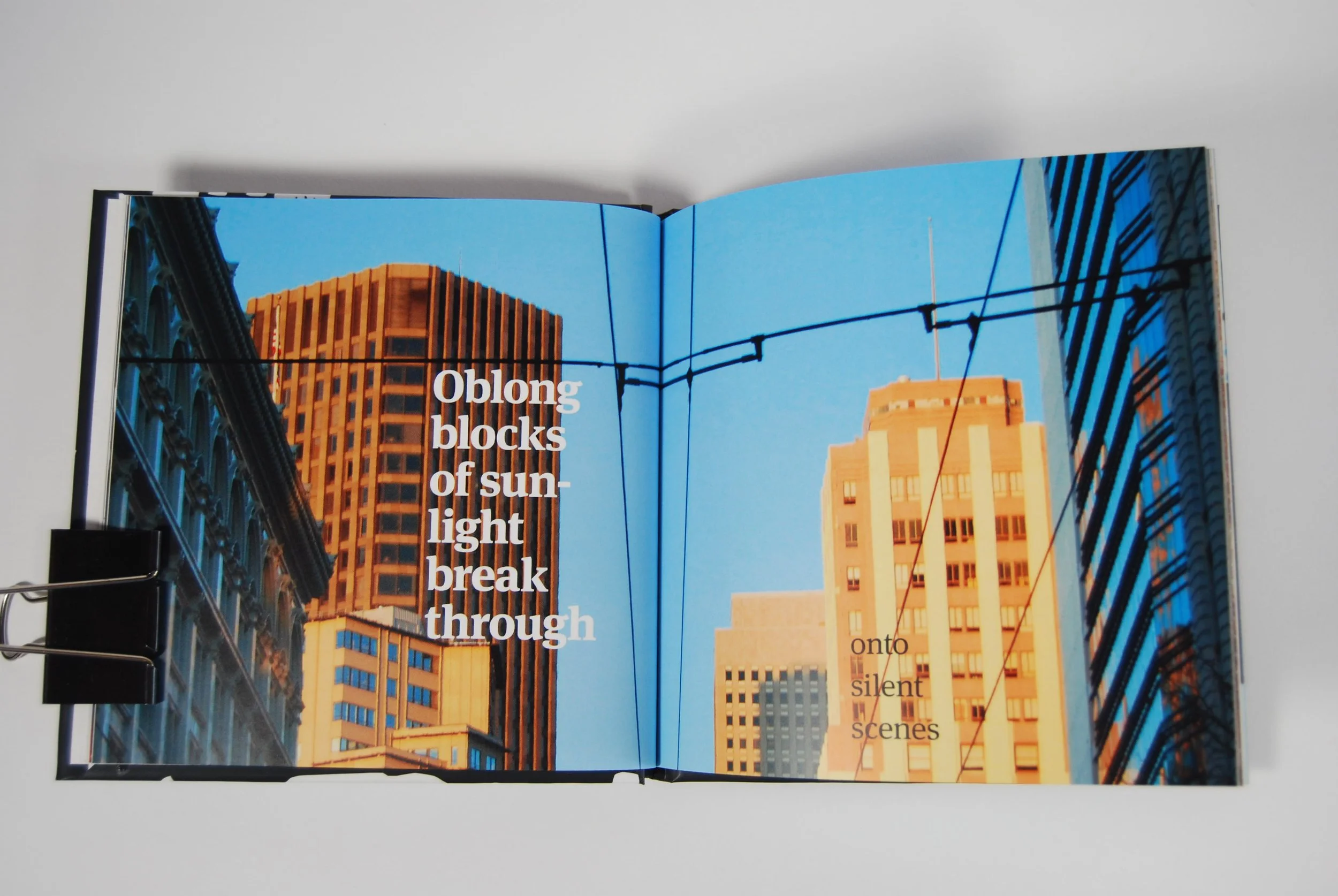
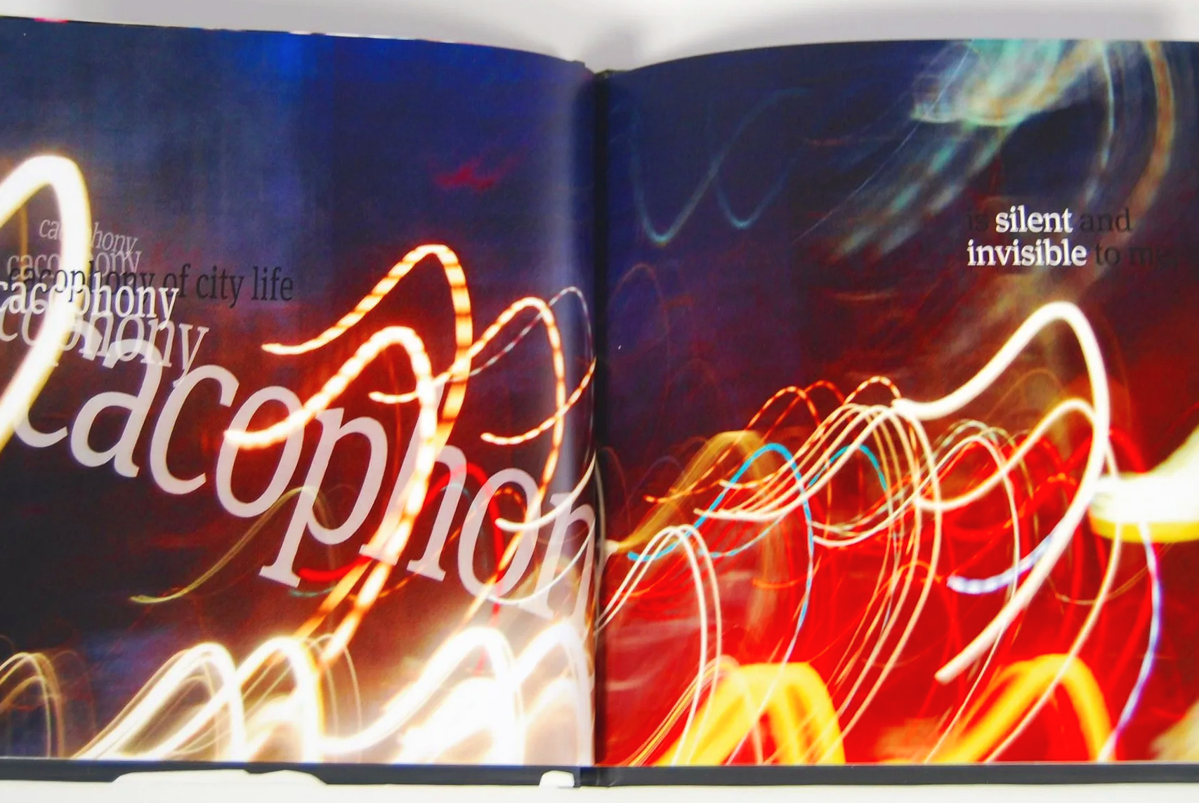
When conceptualizing a layout, I map out the visual pacing of the pages to build tension, create moments of pause, and guide the reader’s eye with deliberate intent. Designing asymmetrical grids that let photography and text interact dynamically. For text-heavy sections it means engineering classical margins that offer comfortable handling of room without crowding the content. I approach editorial design with a deep understanding of production realities, ensuring that every master page, running header, and chapter drop is built into a flawless, press-ready grid system that eliminates costly errors at the printer.
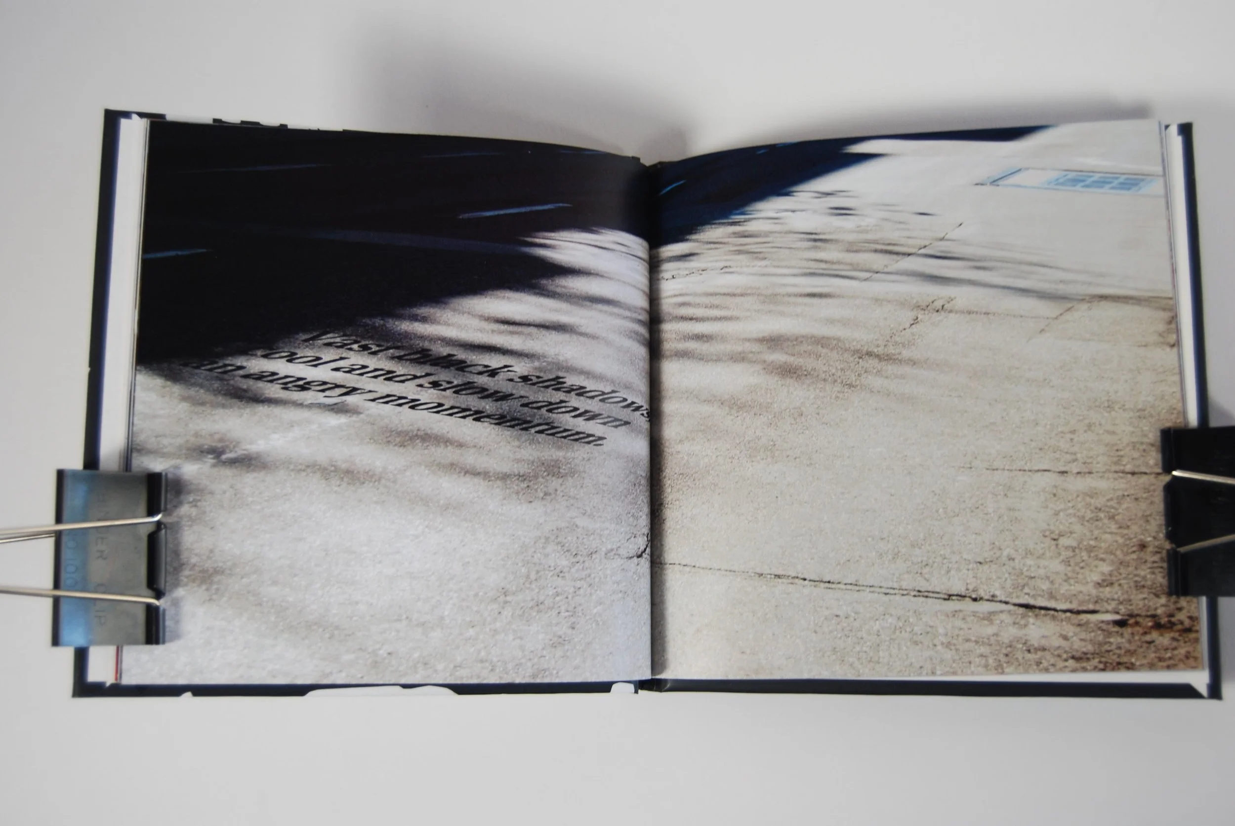
I manage the entire mechanical lifecycle of the project, formatting files to the exact specifications of global distributors, commercial offset presses, or independent print-on-demand services. I understand the complexities of color profiles, bleed tolerances, spine width calculations based on page count, and the nuances of various binding methods, from perfect-bound paperbacks to smythe-sewn casebound hardcovers. By managing these intricate structural details with rigorous precision i ensure a flawless translation from screen to paper, and deliver a stunning, shelf-ready product that elevates your brand and respects your budget.
“The City”
A great book design doesn't just display content but it architecturalizes an experience. As a graphic designer, I view every book as a living, three-dimensional narrative where structural pacing, meticulous typographic hierarchy, and tactile materiality converge. I orchestrate the visual rhythm of the reader's journey, selecting the precise grid systems, tailored margins, and intentional white space that expresses the author's voice. From legible typographic systems and choosing production details such as paper weight, binding style, and cover embellishments—every decision was made to balance aesthetic and functionality.