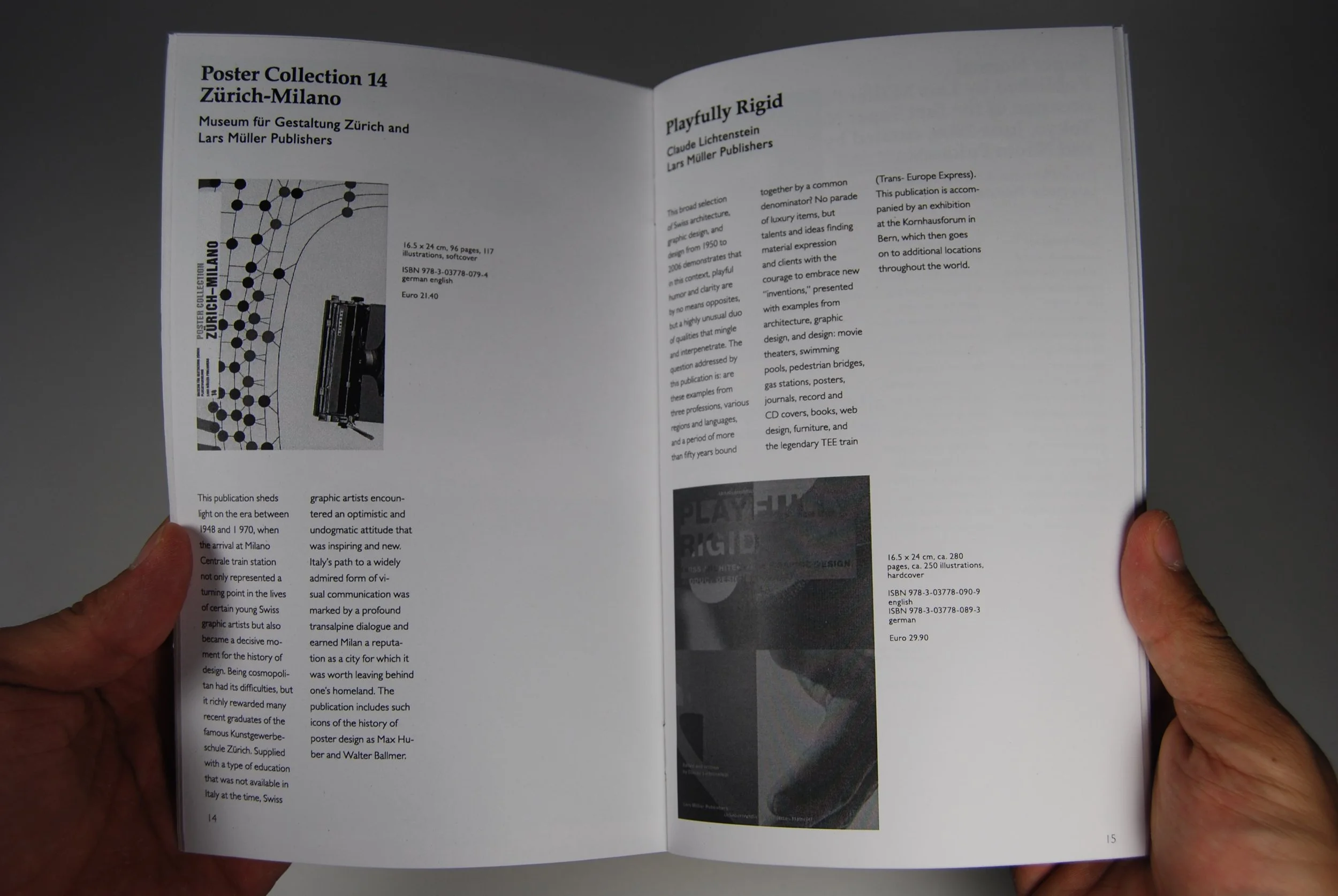
To anchor the vast array of imagery and text, I engineered a rigid multi-column grid system designed to enforce a unified visual harmony across diverse layouts. This structural framework provided a consistent typographic hierarchy, balancing generous structural margins with precise geometric modules. By leveraging the principles of asymmetric balance and conscious utilization of negative space, the grid maintained strict alignment across dense book indexes while allowing individual featured publications to breathe, preventing visual fatigue over multi-page editorial spreads.
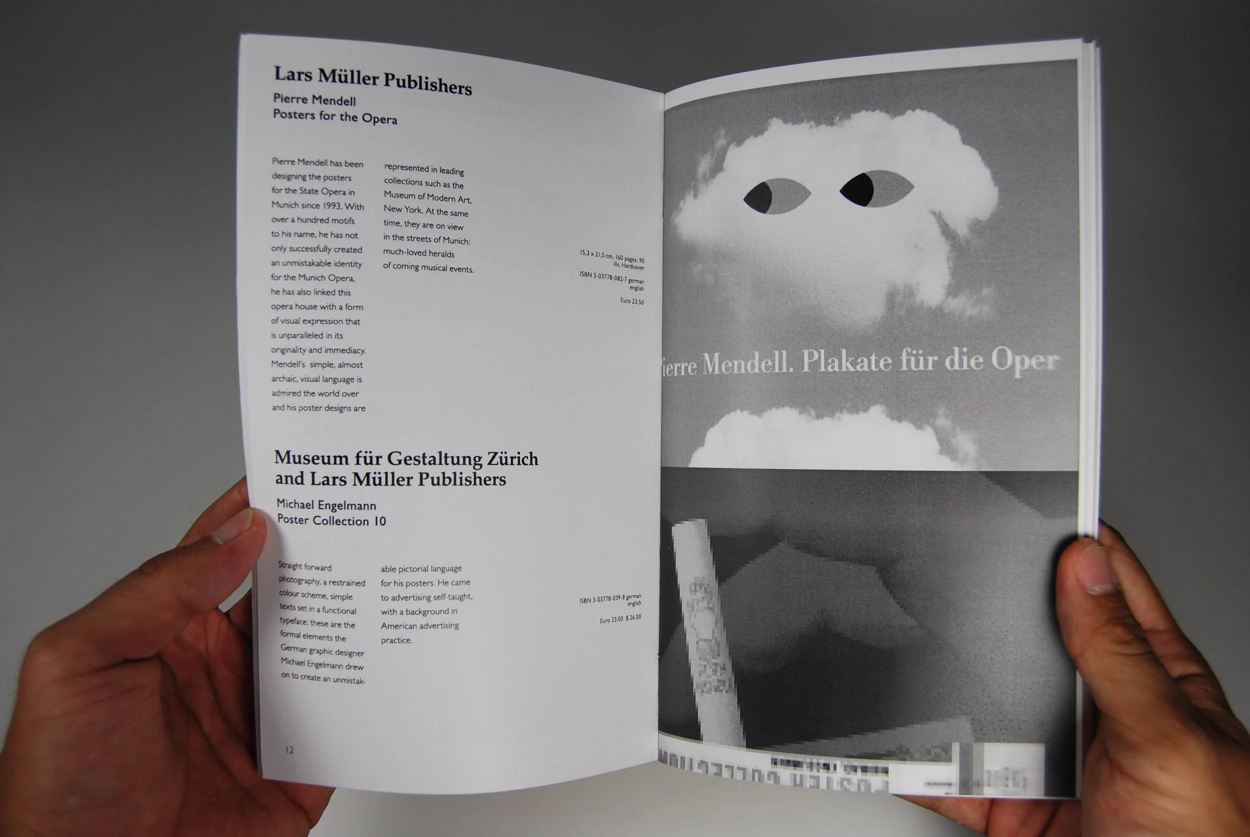
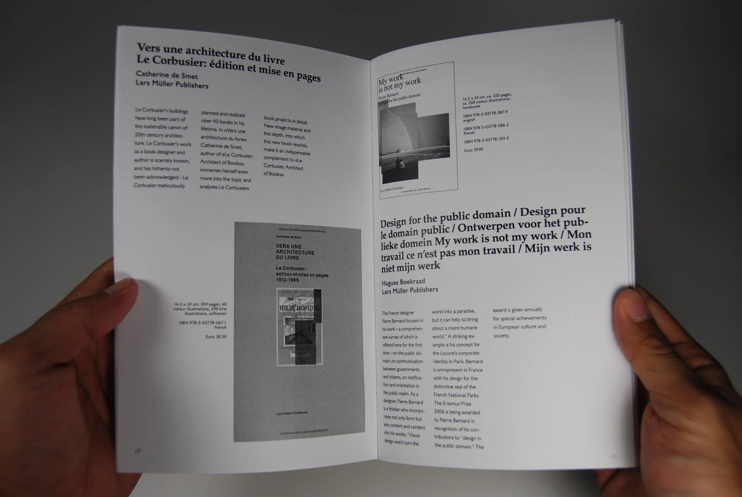
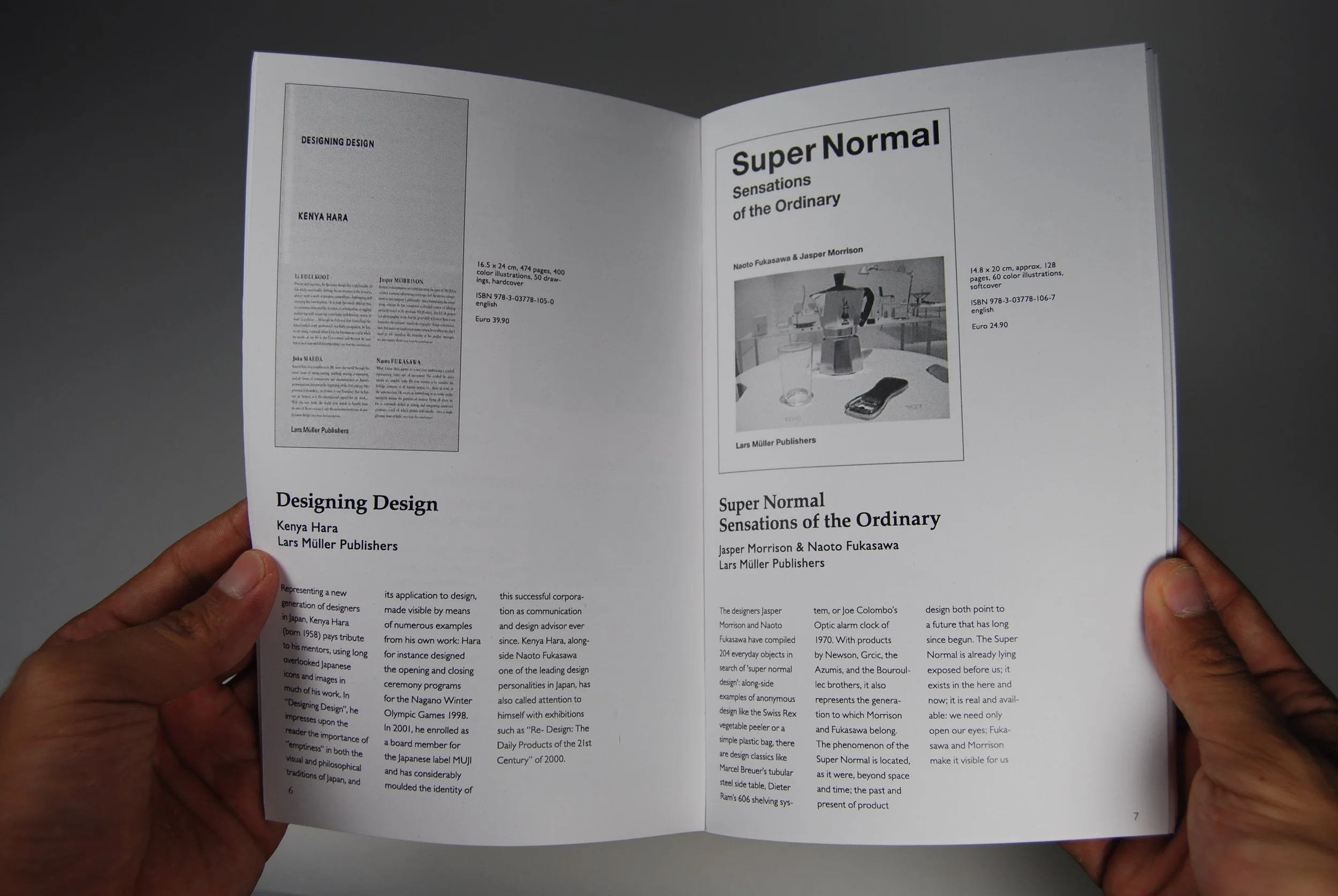
The typographic system relies on a rigorous application of Swiss sans-serif typography, establishing a refined voice through a limited palette of type weights and sizes. Scale and weight contrasts are utilized as primary elements of visual hierarchy, establishing a clean, authoritative structure that prioritizes rapid text legibility and effortless scanning. Micro-typography details—such as precise tracking adjustments on uppercase titles, balanced leading for optimal paragraph rhythm, and careful kerning pairs—were executed systematically to respect the high-integrity printing tradition championed by the Lars Müller ethos.
The technical execution concluded with comprehensive pre-press preparation, focusing on the tactile and physical realities of publication design. Because the physical manifestation of a Lars Müller book relies heavily on material essence, the mechanical files were optimized for an offset print environment using precise ink-density controls, exact color profiling for uncoated paper stocks, and meticulously calculated creep adjustments for section binding. The resulting catalog stands as a cohesive synthesis of form and function, serving as an architectural blueprint of the brand's literary catalog that highlights structural graphic systems over superficial decoration.
“Catalog Project”
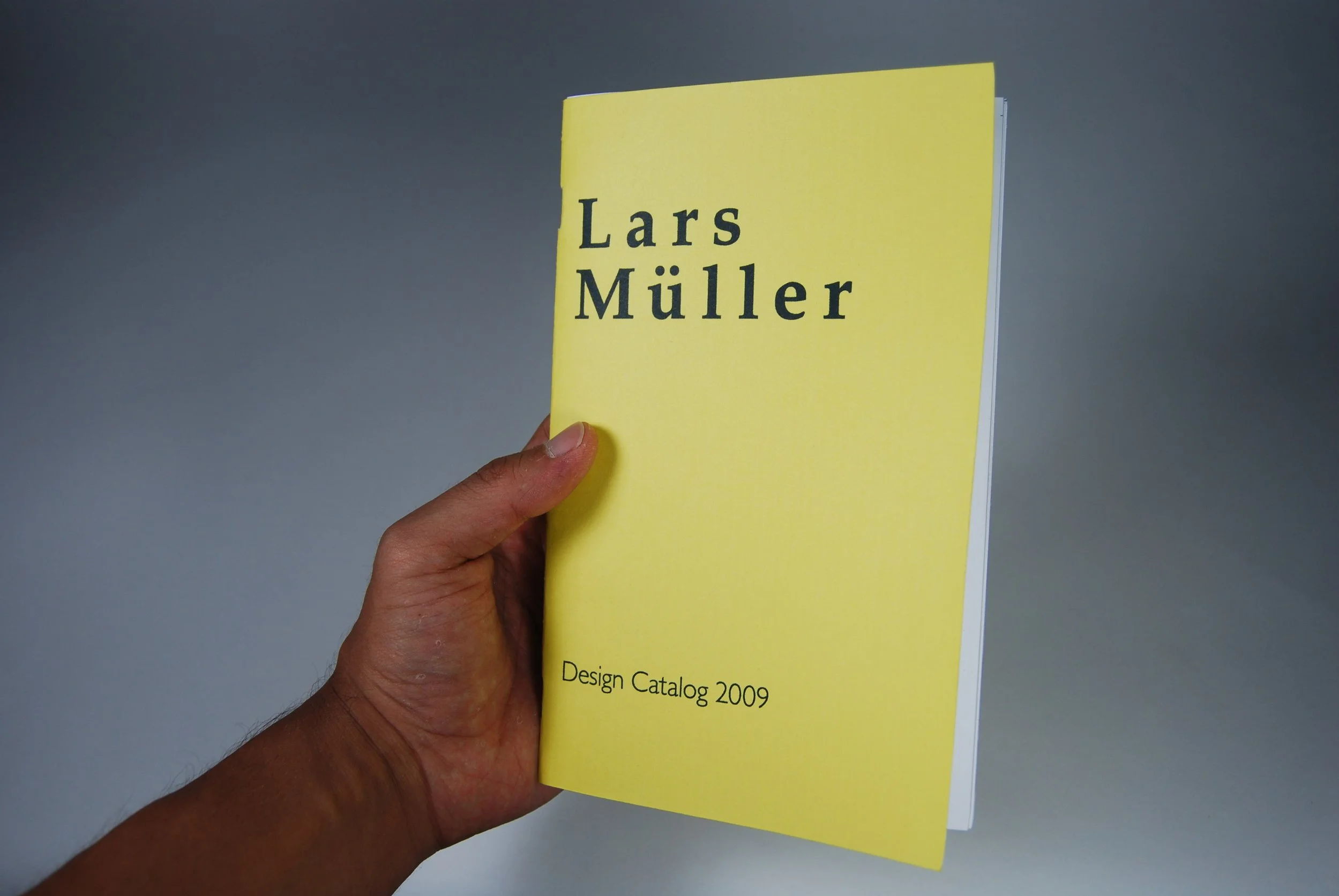
Designing a comprehensive catalog for the esteemed Swiss imprint Lars Müller Publishers required an editorial strategy rooted deeply in the tenets of Swiss Design and modernist typography. The objective was to construct a highly functional commercial tool that simultaneously honored the publisher's legacy of meticulous curation and structural clarity. The process began with an extensive phase of information architecture, systematically categorizing decades of complex architectural, sociological, and design monographs into a logical, user-friendly hierarchy that speaks directly to a discerning design audience.